We are excited to be back in the office collaborating (safely) with our team members, clients, and industry partners. Having a brand new office makes it even better. Our new location is still in the heart of Frederick, at 31 E. Patrick Street, a bustling cross street of our old North Market Street location.
Before and After of our new office exterior!
Aside from sharing our new address, we’ll also be sharing the transformation of our office space. According to old tax documents, the structure itself was built in 1890, and was originally used as a carriage house. We loved the historic feel of it, and have updated the space to a modern interior design firm, with an open floor plan and high ceilings. With a good cleaning, a fresh coat of paint, and sleek signage, the space began its transformation.
Photo Left: Before photo of the interior of this historic building. Photo Right: A fresh coat of paint, and cleaning to the concrete gives new life to this great open space.
We have moved in and look forward to sharing our new workspace, showcasing the furniture and lighting in place. You can find it in our upcoming Part 2 of this blog series. We are currently meeting clients in person or via video conference. Are you ready to start your new design project? We can assist you from project conception and through construction. We’re also offering e-design services for a fully digital design experience.
Chris and the design team are excited for what’s to come… stay tuned!
One of the perks of working from home is that you can tailor your space to fit your style. Your home office should be a space that inspires creativity and productivity at the same time. When designing your office, keep in mind that this is your workspace, so you want to keep focus on professionalism. While the home office is dedicated to work and efficiency, you also want to feel energized and “at home” in this space. There are ways to individualize your office while keeping it functional, the trick is to not go overboard with decorative and personal items.
6 WAYS TO PERSONALIZE YOUR HOME OFFICE
1. Visual Reminders. Add a calendar, bulletin board, or dry erase board near your desk. You can post anything from today’s to do list and reminders, to long term goals. Stay inspired by adding your favorite motivational quote and photos or postcards that are meaningful to you.
2. Stay Organized. It is important that you assign the essentials a designated place in your office space: think business cards, pens, paper and files, folders, sticky notes, etc. that you’ll need within reach. By using creative containers for these essentials, you can achieve a customized look while keeping organized. For example, repurpose a vintage mug to hold pens and pencils, or select binders and boxes with colors, patterns and textures that fit your style.
Photo Right: This office adds personalized touches while keeping neat. The monochromatic color scheme of the storage, wall art, furniture and rug are energized by live plants.
3. Avoid Clutter. Keep your workspace clear for a clear mind. Avoid stacking books and papers. Allow your computer to have a designated space on your desk. Be intentional about the decor you choose to display, and allow enough breathing room on your shelves and wall spaces. Empty spaces have a positive effect as they create balance.
4. Liven Up! Enhance and personalize your work space by adding plants. They radiate energy and life, and promote healthy air. The increased oxygen levels can lower stress and improve productivity. To personalize your foliage, add an interesting vase.
Photo Left: Smart personalization by using paint color, a bulleting board, good storage and plants.
5. Elevate Your Walls. Add wall art for inspiration, personalization, and color. Display your achievements on the walls such as diplomas, accreditations, and awards as a reminder of what you’ve accomplished, and inspiration towards your next goal. You can add a few personal pictures as well, but keep them tasteful and limit how many you use. After all, remember this is a work space and the focus should be on productivity and professionalism.
6. Add Flair To Your Floor. Rugs are a great way to define a space and personalize it. Not only is it a great opportunity to incorporate colors and designs, but also serves the function of sound absorption which can promote concentration.
Photo Right: This office adds personalized touches while keeping neat. The monochromatic color scheme of the storage, wall art, furniture and rug are energized by live plants.
The design and function of your office greatly affects how you think and feel. The items that are used daily should be the only items visible on your desk. The occasional items should be easily stowed away and out of sight, but easily accessible. Your home office should be a carefully curated space that expresses a combination of your personality and goals. By adding personal touches thoughtfully, you can achieve the perfect home office to fit your needs and showcase your individuality.
Photo Left: Personalization for a digital world. If you don’t require physical storage, you still want to be thoughtful on how to fill your space with decor. Photo Right: Even in a small office space, it’s still possible to personalize. Note the art and the empty space that has been left to achieve balance.
Now that you’ve taken the steps to space plan, select the right furniture, and set the feature colors in your office, it’s time to draw attention to your lighting. Lighting is an essential part of the overall design of any space, and is of particular importance when designing it for a work area. A home office allows the opportunity to take a break from the harsh, eye-straining fluorescent lighting you’ve likely adjusted to in a typical office setting. To help the character and quality of lighting in your workspace, consider three lighting elements: temperature of light, ambient lighting, and task lighting. These guidelines will help you achieve a perfect balance of light when natural light is low or unavailable.
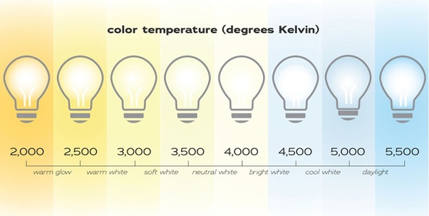
COLOR TEMPERATURE OF LIGHT
The Kelvin scale is used to measure the temperature of light, in which the lower the temperature, the warmer the light tone, and the higher the temperature, the cooler or bluer the light source appears. A traditional incandescent bulb falls around the 2300K to 2700K mark, which has amber tones and an overall warm glow, sometimes referred to as “warm white”. These types of color tones work well for accent lighting or areas that call for a softer glow, such as a sconce or small bulbs on a chandelier in a cozy lounge. At the other end of the spectrum, you will find the ultra white lights, sometimes referred to as “daylight”, which are reminiscent of doctors offices and are equal to 5000K-6000K+. These bright, blueish lights are better fit for places like warehouses, garages, and hospitals.
Photo: Work space making use of natural light, ambient lighting, and task lighting.
AMBIENT LIGHTING
Ambient lighting such as overhead, recessed, or track lights illuminate the space in general, providing an overall level of light in that space. They are the foundation for lighting up a room, however, you should not rely on them to be your only source of illumination. You can incorporate other types of ambient lighting such as a flush mount ceiling light, chandelier, or large pendant to add interest and complement the decor of your office. As a general rule of thumb, chandeliers and pendants should hang in the center of your room with the bottom of the fixture no lower than 6 feet above the finished floor.
Photo Above: The graphic above shows the Kelvin scale from lower temperatures (warmer tones) to higher temperatures (cooler tones).
TASK LIGHTING
Task lighting provides a focused light source and is essential for demanding visual tasks such as reading, writing, and working in front of a computer. These lights focus on the particular area where the task is performed and are ideally brighter than your ambient lighting. It is important to note the placement of your task lighting: make sure to position your light source on the opposite side of your writing hand to avoid shadows cast from your arm, and position bulbs away from your screen to avoid glare. Be sure to provide a task light for each task location, such as a floor lamp in your reading nook, a desk lamp on your work desk, and a pendant light over your work table. Playing with different types of fixtures will create interest while adding function and distinction between each work area.
Photo: Even an office with a dark ceiling can strike lighting balance by way of ambient lighting in the ceiling and intentional task lighting.
NATURAL LIGHTING
While we did not focus on natural lighting on this post, it goes without mention that you should definitely take advantage of natural lighting whenever possible. Several studies have found that natural lighting is beneficial to a workspace by improving mood and promoting productivity. Daylight can provide ambient lighting, which you can compliment with artificial task lighting.
Photo: In this work space, attention has been set to light each task area with a light source.
Selecting the right furniture for your office that encapsulates the right balance of function and aesthetic creates the most positive work environment. Being comfortable improves productivity and reduces strain, aches, and stress. Once you’ve had a chance to assess your immediate space needs as covered in the first part of our blog series, you can get down to the details of selecting the right furniture for your space.
When looking at the aesthetics side of furniture, remember not all your pieces have to match – embrace variety! Don’t be afraid to mix wood tones, colors, and metals. Furniture can act as a pop of color or pattern within your office design. Storage baskets and bulletin boards can add a texture or color, while providing you with a crucial function as well.
Equally as important to aesthetics is function. Make your furniture work for you by selecting the right type for your needs, allowing enough clearance space around it, and avoiding over furnishing your space. Furniture with poor ergonomics can lead to back pain, shoulder ache, leg pain, and neck pain. Below we tackle the basic furniture components of your office and tips on what to look for when choosing them.
Photo Right: A small space fits all the storage needs while keeping neat and organized.
DESKS
Standard desk heights are about 30”, which allows sufficient space for your legs underneath. Besides vertical dimensions, consider the overall size of your desk: are you a creative that needs to spread out your work on a work surface? Are you neat and prefer to work strictly digital? Give yourself enough counter space to fit your working style.
Consider the top of your desk material. A smooth desktop will be comfortable for your to move your work over it, as well as rest your arms while using your computer or laptop. A durable material is important as well, you don’t want to worry about coffee spills or your electronics marring the top. While the reclaimed wood look has been popular lately, it may not be the most comfortable countertop to work on, especially if writing notes. An easy solution to using this or any irregular type of top is adding a durable glass cover that will give you a smooth finish and easy cleanability.
Sit stand desks may be the right choice for you, though they are not for everyone. There are some studies that show the ability to stand at a desk and work can increase productivity. Make sure your desk covers your immediate storage needs accessible to you: built in storage like a drawer for personal items, or file cabinets underneath if you need them.
A quality office desk should integrate with your technology and promote efficiency. You may opt for a desk that includes wire management in the way of grommets to keep cords out of view. Additionally, if you are using a PC, make sure the desk has storage for your CPU below, and that the desk top is deep enough to accommodate your screen and keyboard, or has a keyboard drawer available.
STORAGE
In addition to assessing the amount of storage you will need, determine the types of storage that will work best and look best. Do you need hanging file space? Deep drawers? Do items need to be on display such as books or samples? If you have loose samples, or awkwardly shaped items to store, storage bins can keep them looking organized and clean. Using binders that match your overall office style allows them to serve both function and aesthetic.
It’s easy to manage clutter by assigning enough closed storage in the way of cabinet doors, drawers, or bins as mentioned above.
Photo: A pop of color and comfy chair for a change of space in the corner of an office
DESK CHAIR
Your chair is the key furniture item in your home office. This is where you’ll spend most of your time, so you’ll want something comfortable and supportive. While it may be tempting to pick a chair strictly based on style, you will want to consider a few of the basics needed for ultimate health and productivity. An ergonomic chair is your best bet, which includes lumbar support, adjustability, padding, and a swivel wheel base as well. An ergonomic chair is meant to adapt to the posture of your body.
Lumbar Support. Having good lower back support will prevent back strain. Note the profile of your chair, does it curve and mold to the shape of your spine?
Adjustability. A true ergonomic chair will have several ways it can be adjusted to fit your body best including height, arm rest, back angle, and lumbar adjustments. At a minimum, opt to at least have a height adjustment so that it may suit your seating height best with your desk, and so that your feet may reach the ground comfortably.
Padding. Besides having padding on your back, note the padding of your seat. Sitting on a flat, hard surface can affect your spine negatively, and cause leg pain as it prevents good blood flow to your legs.
Wheel/Swivel Base. When you’re using your office for full days, being able to move around and rotate is essential. A base with wheels makes it easy to scoot from desk to bookcase and back, and prevent strain from having to reach across your desk for items not in immediate arms length. Rotation ability allows for easy reach on an L shaped desk or storage off to the side.
Photo Right: Matching bins and binders keep the clutter stowed away in this open shelf concept.
MAKE ROOM FOR BREAKS
Besides the expected desk and desk chair setup, having additional lounge type seating can act as a nice change of scenery and serve as a temporary work station. Studies show that workers who take regular breaks are more productive. You’ll have an easier time taking these breaks if you create a comfortable getaway space in your office. Choose a comfortable chair or small scale sofa to create a cozy corner and escape from your desk.
Photo: A pop of color and comfy chair for a change of space in the corner of an office
THE POWER OF CHOOSING COLOR
One of the benefits of working from home is the ability to design a personalized office space that inspires and motivates you. Color is arguably one of the most important design elements to incorporate into your space. Some things to consider when choosing the color of your home office: How much time will you be spending there? What type of work are you doing? What is your working style? Choosing the right color(s) can increase productivity, have positive psychological effects, and spark creativity. Color comes in a variety of moods and shades, but whether you want to go for a muted color scheme or controlled pops of color, striking the right balance is key. This is the second part of our five part series, providing you with helpful design tips for you to create a functional and successful home office.
COLOR PSYCHOLOGY
Blues – Calming, Relaxing, Serene. A fresh blue hue can help you stay focused and productive as it induces tranquillity and security. Too much blue can feel cold or give a sense of sadness, pair it with clean whites or warm wood tones for balance.
Greens – Fresh, Restful to the eye. Due to the association with nature and vegetation, it brings life to a space and represents growth. Green contains the calm quality of blue and the energy of yellow.
Yellows – Bright and Stimulating. Represents positivity, energy, and optimism. Mental invigoration. A good accent color to use against a neutral or calming tone, too much yellow can cause anxiety.
Oranges – Energetic, friendly, and enthusiastic. It has reds in it which can be warm but also straining, so use as an accent or in a pattern that mixes it with white.
Reds – Intense, raises energy levels, passionate. Too much of this color can be distracting and straining to the eye, and is associated with aggression, so use thoughtfully and sparingly.
Purples – Wisdom, serenity. Has a certain richness to it that inspires whimsy, creativity, and magic. The blue tones in purple help balance its own red tones. Careful to use the right amount as it can be moody, especially dark purple.
Photo Left: Red is thoughtfully used pops by using it in the furniture, including this Eames inspired chair and ottoman. Photo Center: Adding crisp whites, including the shelves, add relief over this saturated pop of orange. Photo Right: A muted mauve is offset by varying shades of gray.
MUTED AND NEUTRAL COLORS
Muted Hues – Muted hues are toned down versions of colors. By adding light or dark grays, the original colors are desaturated while the essence of the color still shows. They are perfect for a home office as they introduce color in a sophisticated way that won’t be too energetic or distracting. Use the color guide above to pick your favorite, and then mute it down a little or alot for the ideal muted color.
Neutrals – White, Gray, Black – Neutrals are staples in any design. Add color to liven things up, subtract color to calm things down. More details below!
Whites – Clarity, Simplicity, Clean and Fresh. White is refreshing, it delivers relief to any color and gives a sense of openness. Make sure to offset whites with a little color to avoid your office from feeling too stark or feel bland.
Grays – Balance, Calm, and Elegant. Grays give a sense of stability and provide a steady backdrop for colors to shine through. Balance the neutrality of grays with color to avoid a lack of energy and boredom.
Blacks – Sophisticated, Timeless, Dramatic. A classic and unambiguous color. Use it in small pops to accentuate colors and whites. Due to its inherent darkness, avoid large doses of it in a home office space as it can be oppressive and heavy.
Photo Left: The black tones in this office is nicely balanced by bright whites and a soft yellow and white rug. Photo Right: The natural orange tones in the wood shelf and leather pouf give warmth to this otherwise monochromatic, neutral office.
Working from home comes with plenty of distractions and temptations that can get you off track. Dealing with stresses and uncertainties during the COVID pandemic is overwhelming enough, creating a designated workspace that promotes concentration and productivity is essential. We’re excited to present you with the first of our five-part series, providing you with helpful design tips for you to create a functional and successful home office. This first part focuses on space planning.
WHAT ARE YOUR SPACE REQUIREMENTS?
When designing your home office, it is important to ask yourself a series of questions to establish basic spatial relationships for your work area:
- how do you select the location of your desk?
- how much desktop space do you need to work comfortably?
- how much storage space do you require?
- how accessible does this storage of files, books, or samples need to be from your desk?
Photo Right: Mid-Century style office with open and closed storage, an L-shaped desk, and plenty of space for the desk chair.
PLACING YOUR DESK IN THE SPACE AND ASSESSING STORAGE NEEDS
The first step in laying out your home office is determining the placement of your desk. Consider your work habits and how you envision yourself working most effectively. If your job requires that you meet with clients, placing your desk facing the doorway creates a welcoming feeling for all guests that enter. For a job in the creative field, you may choose to place your desk in front of a window – the changing view outside can prove to be inspiring. It is important to note, windows that are street facing or street level can be a distraction.
Consider your immediate storage needs, do you require a printer, scanner or document shredder? Think about whether you want these neatly packed away, or within easy reach on a worktop. Less is more when it comes to storage, only make room for the necessities so as not to over furnish or over clutter.
Photo Left: Modern space saver office with closed storage, floating shelves, and good desktop space
Photo Left: Office space for a digital world: you may not need much storage at all based on the type of work you do. Photo Right: Go vertical with storage! An excellent example of making the most of a single wall space.
UTILIZING A SPARE ROOM, TEMPORARY WORK AREAS, AND MAXIMIZING STORAGE
Unable to dedicate an entire room to a home office? There are still smart space planning ways to utilize a section of a guest room or other area of your home. If a corner of the room is available, an L-shaped desk would give you maximum work surface area, to which you can add extra storage by adding a hutch or use the space underneath for file cabinets and drawers. If a single wall is available, you can maximize storage with open shelving above your desk, keeping your floor space clear or adding a file cabinet below.
Photo Bottom Right: This office uses a single wall in an existing sitting room setting, with shelves above for storage.
If you are looking for an at home working area, but are lacking in extra space, there are still ways to create a home office environment. An alternative desk, comfortable chair, and storage are all it takes to construct a temporary office that transitions from work to weekend. Start by finding a secluded location in your home, with minimal foot traffic and lots of natural light. Ideally, this workstation isn’t in close proximity to your bedroom so as to strengthen the distinction between a space of relaxation and a space for work and concentration. Think outside the box! Utilize a dining room table or console as your desk. Station yourself and place laptops, phones, and other electronics close to an outlet to reduce wire clutter. Repurpose an existing dining chair with a removable seat cushion or bring in a comfortable rolling chair. Storage on wheels such as a rolling filing cabinet or set of drawers allows for you to easily tuck it away in a closet or corner of the room after work hours. Ready to revamp your home office? Contact us to ask about our e-design packages or full design services.
Photo Top Left: A modern office space within a living room is complete with a desktop and shelves above.
Your kitchen is the center of activity where friends and family often gather. For this reason, it’s important the design feels warm and welcoming. Your island is central to your kitchen, serving as a centerpiece that draws the eye. Adding a contrasting island color is a great way to add personality and visual interest.
Choosing the right color
Consider the color scheme throughout your home. If you have an open floor plan where your kitchen is adjacent to another living space, incorporate the same accent color throughout in details such as fabrics, accent pieces, or art you wish to highlight.
As an initial inspiration, you may look to existing features for undertones in surfaces such as countertops and backsplash. For example, you may draw inspiration for your color palette from striations and variations in marble, which can present hints of amber, pale blue and even indigo.
Photo Left: Our client’s Annapolis home we recently completed. The blue island pops against white cabinets, with hues hinting at blue on the natural marble countertop. Photo Right: A muted green island surrounded by white cabinets.
Granite and other natural stones come in a multitude of earthy tones, which may inspire a more muted palette. Charcoal grey, ochre, and sage are rich neutrals that, when paired with bright white cabinetry, create a warm and sophisticated palette.
Photo: A neutral palette can still have interest. Drawing from the colors of the granite, this island makes a dark bold statement.
Finishing Touches
Adding a pop of color is all about striking a balance. Incorporating bits of your chosen color to your décor such as dish towels, canisters and floor mats is essential. This attention to detail will ensure your design is cohesive and intentional. If you are interested in a color consultation with our design team, connect with us by sending us a message.
“Welcome to the design world.” – Ritchie
Get a sneak preview of the new pilot for a Zoltan Design Co. television show. The concept is to follow our team, documenting our design projects throughout the Mid-Atlantic. In the trailer, you can see Creative Director, Christopher Ritchie, and Lead Designer, Teri Mazariegos, walk through a residential space right on the water in Annapolis. Just outside the client’s house is the beautiful Chesapeake, where you can see the Bay Bridge in the distance.
Later on, you get a glimpse of the ups and downs of the delivery and installation process. After some bad weather and a short delay, we get to see the finished product. “This is what makes design cool,” Ritchie sums up at the end of the clip.
Back in Frederick, Chris meets up with the owner of a recently completed restaurant project: the trendy Hootch & Banter. The owner requested a blend of styles to offset the industrial feel of the old brick buildings downtown with a selection of chic, mid-century modern chairs, stools and lighting styles. Chris then walks up the street to the ZDC offices to catch up with the design team.
With the potential we see in this new show pilot, and more announcements coming soon, we’re excited for what this year holds at Zoltan Design Co.
Which TV network would you like to see us on?
Check out one of our latest completed residential interior design projects. This beautiful townhome is located in the recently revitalized neighborhood of Maxwell Square in historic downtown Frederick, Maryland. The couple who owns the house requested an industrial, modern style for the lighting and furniture. To achieve this kind of look, Chris Ritchie and the design team selected pieces with exposed raw materials: wood, steel, brass, white marble and glass.
Photo Left: View of the whole kitchen, looking into the living room. Photo Right: View of kitchen island with white marble top and industrial, steel swivel stools.
By using warm colored woods in this open floor plan and on the kitchen cabinets, the transition from industrial to modern is seamless. A custom suite of ceiling lights, brass chandeliers and pendants play off of a white ceiling and light grey walls to brighten the entire space. These selections maximize the natural light that falls through the windows on either side. As a result, the townhome feels comforting and awake, with a gentle reminder that you are still in the heart of a bustling little downtown.
Photo Left: Orb chandelier with decor in the background. Photo Right: Linear chandelier over dining table.
ANTIQUE OAK ~ FROM OLD TO RENEWED
By Amanda Kowalski from Cochrans Lumber
Here at Cochran’s Lumber, we love seeing a good ‘Before and After’ renovation from our clients! The recent renovation of the iconic Bavarian Inn in historic Shepherdstown, WV may just be the best we have seen this year. Boldly designed by our friends at Frederick, MD based Zoltan Design Co., the inn was transformed from a dark, out-of-style space into a polished, comfortable bar, lounge, and eating area. Complete with flooring to ceiling windows, a glass-enclosed brewery, and of course our classic Antique Oak Distressed flooring, Zoltan Design Co. delivered not only a functional dining space but also a wow factor that patrons will enjoy for many years. Prost!
Below: Bar/Lounge Before
Above: Bar/Lounge After
RANDOM WIDTH ~ SINGLE PURPOSE
“The Bavarian Inn project was special because its design work was a combination of remodeling existing components, as well as the addition of a brand new, adjoining brewery and brewpub buildings. The location has a rich history and called for materials that would balance a fresh, updated look, while still being transitional and in line with the character of the building.
We selected Antique Oak, distressed in varying widths and lengths for flooring. It has a worn character and weathered look, displaying its history in every bit of patina and imperfection. The same wood floor runs from the remodeled bar area into the new brewpub seating area, blending the old and new spaces seamlessly.
The bar area now displays more modern furniture, with bright nailheads and mirrored backsplash tile, providing a beautiful balance to the existing stone walls and rich, history-filled, Antique Oak floor. The same layering effect is seen in the new brewpub area with its incredible architecture of wood beams against modern antique silver pendants; and the new modern furniture against the weathered Antique Oak floor. Overall, the Inn has received a new, updated look without compromising its story – the story and charm that makes this place special to many of its patrons and will for years to come.”
-Christopher Zoltan Ritchie, Creative Director and Founder of Zoltan Design Co.