Selecting the right furniture for your office that encapsulates the right balance of function and aesthetic creates the most positive work environment. Being comfortable improves productivity and reduces strain, aches, and stress. Once you’ve had a chance to assess your immediate space needs as covered in the first part of our blog series, you can get down to the details of selecting the right furniture for your space.

When looking at the aesthetics side of furniture, remember not all your pieces have to match – embrace variety! Don’t be afraid to mix wood tones, colors, and metals. Furniture can act as a pop of color or pattern within your office design. Storage baskets and bulletin boards can add a texture or color, while providing you with a crucial function as well.

Equally as important to aesthetics is function. Make your furniture work for you by selecting the right type for your needs, allowing enough clearance space around it, and avoiding over furnishing your space. Furniture with poor ergonomics can lead to back pain, shoulder ache, leg pain, and neck pain. Below we tackle the basic furniture components of your office and tips on what to look for when choosing them.

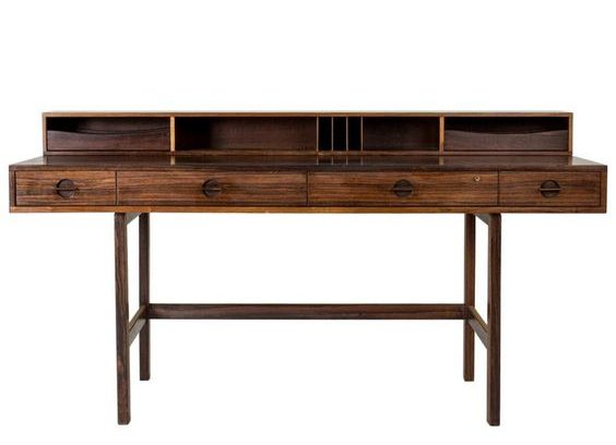
Photo Right: A small space fits all the storage needs while keeping neat and organized.

DESKS

Standard desk heights are about 30”, which allows sufficient space for your legs underneath. Besides vertical dimensions, consider the overall size of your desk: are you a creative that needs to spread out your work on a work surface? Are you neat and prefer to work strictly digital? Give yourself enough counter space to fit your working style.

Consider the top of your desk material. A smooth desktop will be comfortable for your to move your work over it, as well as rest your arms while using your computer or laptop. A durable material is important as well, you don’t want to worry about coffee spills or your electronics marring the top. While the reclaimed wood look has been popular lately, it may not be the most comfortable countertop to work on, especially if writing notes. An easy solution to using this or any irregular type of top is adding a durable glass cover that will give you a smooth finish and easy cleanability.

Sit stand desks may be the right choice for you, though they are not for everyone. There are some studies that show the ability to stand at a desk and work can increase productivity. Make sure your desk covers your immediate storage needs accessible to you: built in storage like a drawer for personal items, or file cabinets underneath if you need them.

A quality office desk should integrate with your technology and promote efficiency. You may opt for a desk that includes wire management in the way of grommets to keep cords out of view. Additionally, if you are using a PC, make sure the desk has storage for your CPU below, and that the desk top is deep enough to accommodate your screen and keyboard, or has a keyboard drawer available.

STORAGE

In addition to assessing the amount of storage you will need, determine the types of storage that will work best and look best. Do you need hanging file space? Deep drawers? Do items need to be on display such as books or samples? If you have loose samples, or awkwardly shaped items to store, storage bins can keep them looking organized and clean. Using binders that match your overall office style allows them to serve both function and aesthetic.
It’s easy to manage clutter by assigning enough closed storage in the way of cabinet doors, drawers, or bins as mentioned above.

Photo: A pop of color and comfy chair for a change of space in the corner of an office

DESK CHAIR

Your chair is the key furniture item in your home office. This is where you’ll spend most of your time, so you’ll want something comfortable and supportive. While it may be tempting to pick a chair strictly based on style, you will want to consider a few of the basics needed for ultimate health and productivity. An ergonomic chair is your best bet, which includes lumbar support, adjustability, padding, and a swivel wheel base as well. An ergonomic chair is meant to adapt to the posture of your body.

Lumbar Support. Having good lower back support will prevent back strain. Note the profile of your chair, does it curve and mold to the shape of your spine?
Adjustability. A true ergonomic chair will have several ways it can be adjusted to fit your body best including height, arm rest, back angle, and lumbar adjustments. At a minimum, opt to at least have a height adjustment so that it may suit your seating height best with your desk, and so that your feet may reach the ground comfortably.

Padding. Besides having padding on your back, note the padding of your seat. Sitting on a flat, hard surface can affect your spine negatively, and cause leg pain as it prevents good blood flow to your legs.

Wheel/Swivel Base. When you’re using your office for full days, being able to move around and rotate is essential. A base with wheels makes it easy to scoot from desk to bookcase and back, and prevent strain from having to reach across your desk for items not in immediate arms length. Rotation ability allows for easy reach on an L shaped desk or storage off to the side.

Photo Right: Matching bins and binders keep the clutter stowed away in this open shelf concept.


MAKE ROOM FOR BREAKS

Besides the expected desk and desk chair setup, having additional lounge type seating can act as a nice change of scenery and serve as a temporary work station. Studies show that workers who take regular breaks are more productive. You’ll have an easier time taking these breaks if you create a comfortable getaway space in your office. Choose a comfortable chair or small scale sofa to create a cozy corner and escape from your desk.

Photo: A pop of color and comfy chair for a change of space in the corner of an office

THE POWER OF CHOOSING COLOR

One of the benefits of working from home is the ability to design a personalized office space that inspires and motivates you. Color is arguably one of the most important design elements to incorporate into your space. Some things to consider when choosing the color of your home office: How much time will you be spending there? What type of work are you doing? What is your working style? Choosing the right color(s) can increase productivity, have positive psychological effects, and spark creativity. Color comes in a variety of moods and shades, but whether you want to go for a muted color scheme or controlled pops of color, striking the right balance is key. This is the second part of our five part series, providing you with helpful design tips for you to create a functional and successful home office.

COLOR PSYCHOLOGY

Blues – Calming, Relaxing, Serene. A fresh blue hue can help you stay focused and productive as it induces tranquillity and security. Too much blue can feel cold or give a sense of sadness, pair it with clean whites or warm wood tones for balance.

Greens – Fresh, Restful to the eye. Due to the association with nature and vegetation, it brings life to a space and represents growth. Green contains the calm quality of blue and the energy of yellow.

Yellows – Bright and Stimulating. Represents positivity, energy, and optimism. Mental invigoration. A good accent color to use against a neutral or calming tone, too much yellow can cause anxiety.

Oranges – Energetic, friendly, and enthusiastic. It has reds in it which can be warm but also straining, so use as an accent or in a pattern that mixes it with white.

Reds – Intense, raises energy levels, passionate. Too much of this color can be distracting and straining to the eye, and is associated with aggression, so use thoughtfully and sparingly.

Purples – Wisdom, serenity. Has a certain richness to it that inspires whimsy, creativity, and magic. The blue tones in purple help balance its own red tones. Careful to use the right amount as it can be moody, especially dark purple.


Photo Left: Red is thoughtfully used pops by using it in the furniture, including this Eames inspired chair and ottoman. Photo Center: Adding crisp whites, including the shelves, add relief over this saturated pop of orange. Photo Right: A muted mauve is offset by varying shades of gray.

MUTED AND NEUTRAL COLORS

Muted Hues – Muted hues are toned down versions of colors. By adding light or dark grays, the original colors are desaturated while the essence of the color still shows. They are perfect for a home office as they introduce color in a sophisticated way that won’t be too energetic or distracting. Use the color guide above to pick your favorite, and then mute it down a little or alot for the ideal muted color. 

Neutrals – White, Gray, Black – Neutrals are staples in any design. Add color to liven things up, subtract color to calm things down. More details below!

Whites – Clarity, Simplicity, Clean and Fresh. White is refreshing, it delivers relief to any color and gives a sense of openness. Make sure to offset whites with a little color to avoid your office from feeling too stark or feel bland.

Grays – Balance, Calm, and Elegant. Grays give a sense of stability and provide a steady backdrop for colors to shine through. Balance the neutrality of grays with color to avoid a lack of energy and boredom.

Blacks  – Sophisticated, Timeless, Dramatic. A classic and unambiguous color. Use it in small pops to accentuate colors and whites. Due to its inherent darkness, avoid large doses of it in a home office space as it can be oppressive and heavy.

Photo Left: The black tones in this office is nicely balanced by bright whites and a soft yellow and white rug. Photo Right: The natural orange tones in the wood shelf and leather pouf give warmth to this otherwise monochromatic, neutral office.

Your kitchen is the center of activity where friends and family often gather. For this reason, it’s important the design feels warm and welcoming. Your island is central to your kitchen, serving as a centerpiece that draws the eye. Adding a contrasting island color is a great way to add personality and visual interest.

Choosing the right color 

Consider the color scheme throughout your home. If you have an open floor plan where your kitchen is adjacent to another living space, incorporate the same accent color throughout in details such as fabrics, accent pieces, or art you wish to highlight.

As an initial inspiration, you may look to existing features for undertones in surfaces such as countertops and backsplash.  For example, you may draw inspiration for your color palette from striations and variations in marble, which can present hints of amber, pale blue and even indigo.


Photo Left: Our client’s Annapolis home we recently completed. The blue island pops against white cabinets, with hues hinting at blue on the natural marble countertop.  Photo Right: A muted green island surrounded by white cabinets.

Granite and other natural stones come in a multitude of earthy tones, which may inspire a more muted palette.  Charcoal grey, ochre, and sage are rich neutrals that, when paired with bright white cabinetry, create a warm and sophisticated palette.

 
Photo: A neutral palette can still have interest. Drawing from the colors of the granite, this island makes a dark bold statement.

Finishing Touches

Adding a pop of color is all about striking a balance.  Incorporating bits of your chosen color to your décor such as dish towels, canisters and floor mats is essential.  This attention to detail will ensure your design is cohesive and intentional. If you are interested in a color consultation with our design team, connect with us by sending us a message.